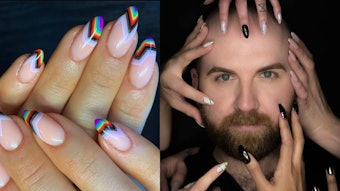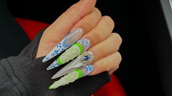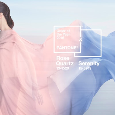
This is actually the first year that Pantone has picked two colors – and we totally appreciate that. It gives us in the beauty and fashion world a little more variety rather than focusing on a single hue all year long. We also hope the multiple shades will further encourage nail artists to try patterns, prints, and mismatched manicures that incorporate more than one main tone. We also hope this announcement inspires fun duochrome polishes that reflect shades of both rose and cornflower blue.
“With the whole greater than its individual parts, joined together Serenity and Rose Quartz demonstrate an inherent balance between a warmer embracing rose tone and the cooler tranquil blue, reflecting connection and wellness as well as a soothing sense of order and peace,” said Leatrice Eiseman, Executive Director of the Pantone Color Institute. “In many parts of the world we are experiencing a gender blur as it relates to fashion, which has in turn impacted color trends throughout all other areas of design.”
The Pantone team actually selects each Color of the Year by carefully noting the most used shades on runways at New York Fashion Week and this year, interestingly, was the first that Men’s Fashion Week got its own separate calendar due to the increasing popularity of fashion for men. This ensured that menswear designers got just as much of an audience and spotlight as designers of women’s clothing, instead of getting pushed to the second tier when scheduling conflicts arose between the two.
Adds Eiseman, “This more unilateral approach to color is coinciding with societal movements toward gender equality and fluidity, the consumers’ increased comfort with using color as a form of expression which includes a generation that has less concern about being typecast or judged, and an open exchange of digital information that has opened our eyes to different approaches to color usage.”
Images: Pantone
